
Building a Brand That Feels Human
For Pathways Rehab, this project needed to be more than just a logo.
Branding sets the tone. Web Design turns it into experience.
When people think of healthcare branding, they tend to picture the same things.
Muted blues, generic icons, sterile photography, and websites that feel more functional than memorable.
Clinical. Safe. Predictable. But predictable isn’t always persuasive.
When Pathways Rehab came to us for branding and web design, they weren’t looking to blend in. They wanted to create something that genuinely reflected who they are, how they care, and why their approach to rehabilitation is different.
And that’s exactly where great branding begins.
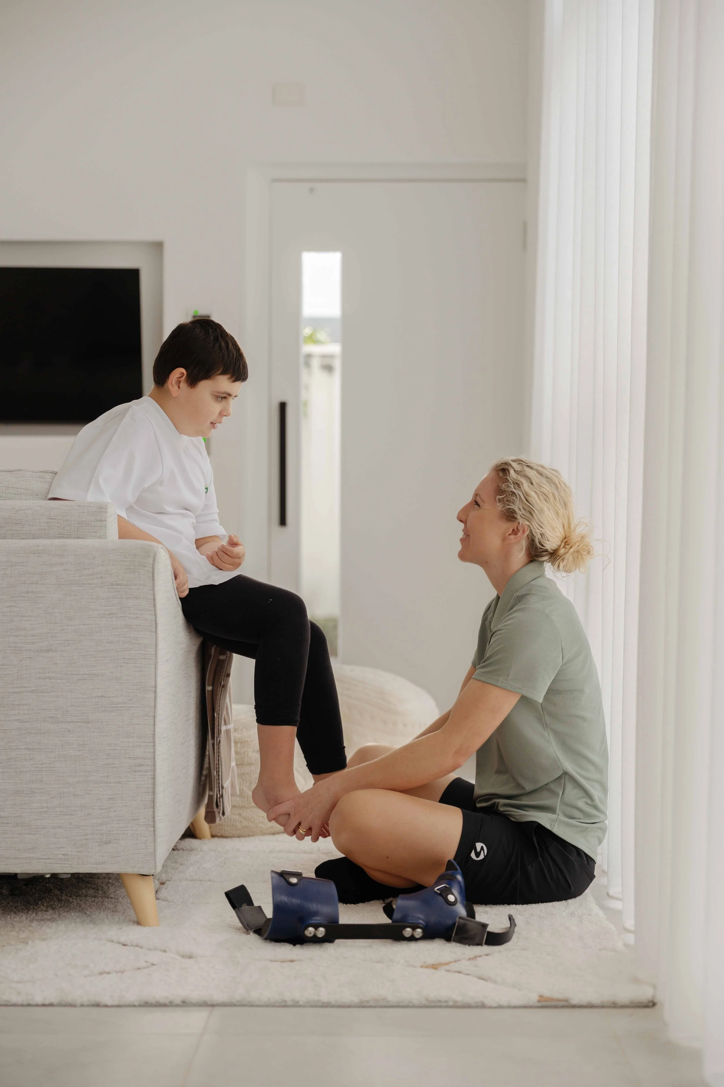
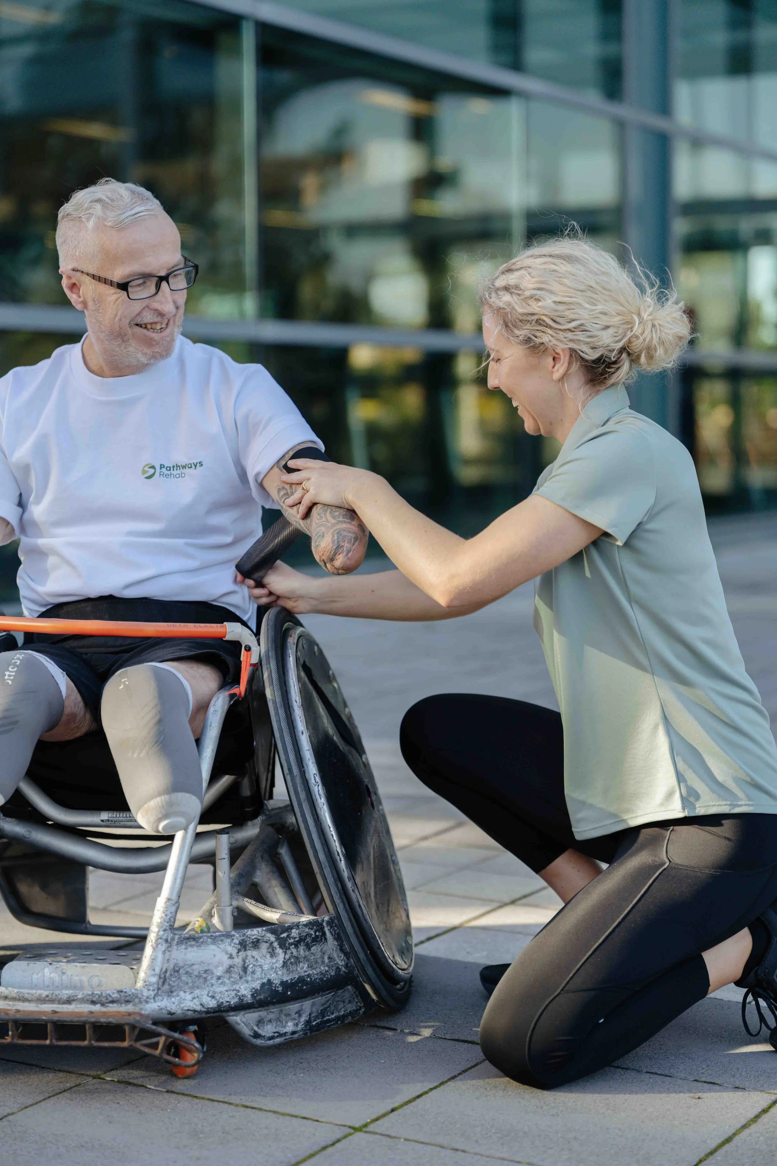
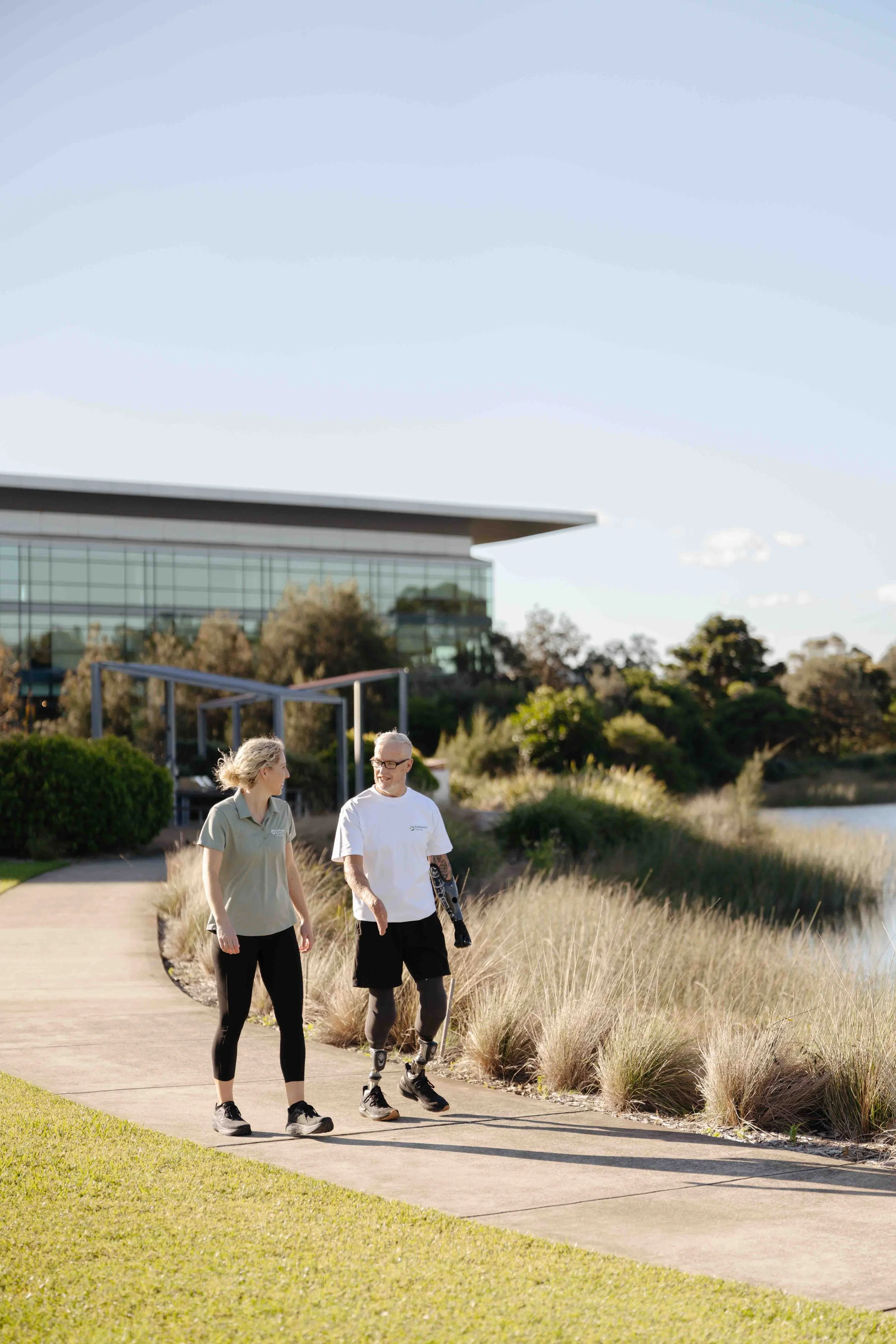
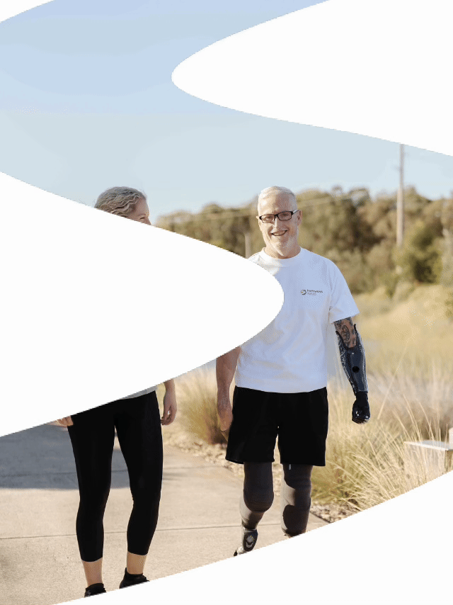
Pathways Rehab provides mobile neurological physiotherapy throughout the Illawarra, helping people with neurological and complex physical disabilities access highly specialised rehabilitation wherever therapy is most relevant to life. Their entire philosophy is built around personalised care and recognising that every rehabilitation journey is unique.
The brand needed to honour that level of professionalism whilst feeling warm, optimistic and deeply human.
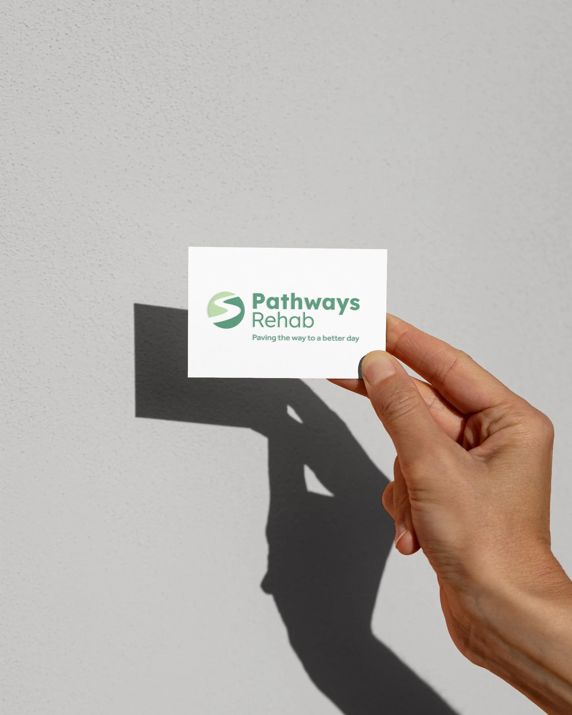
The Solution
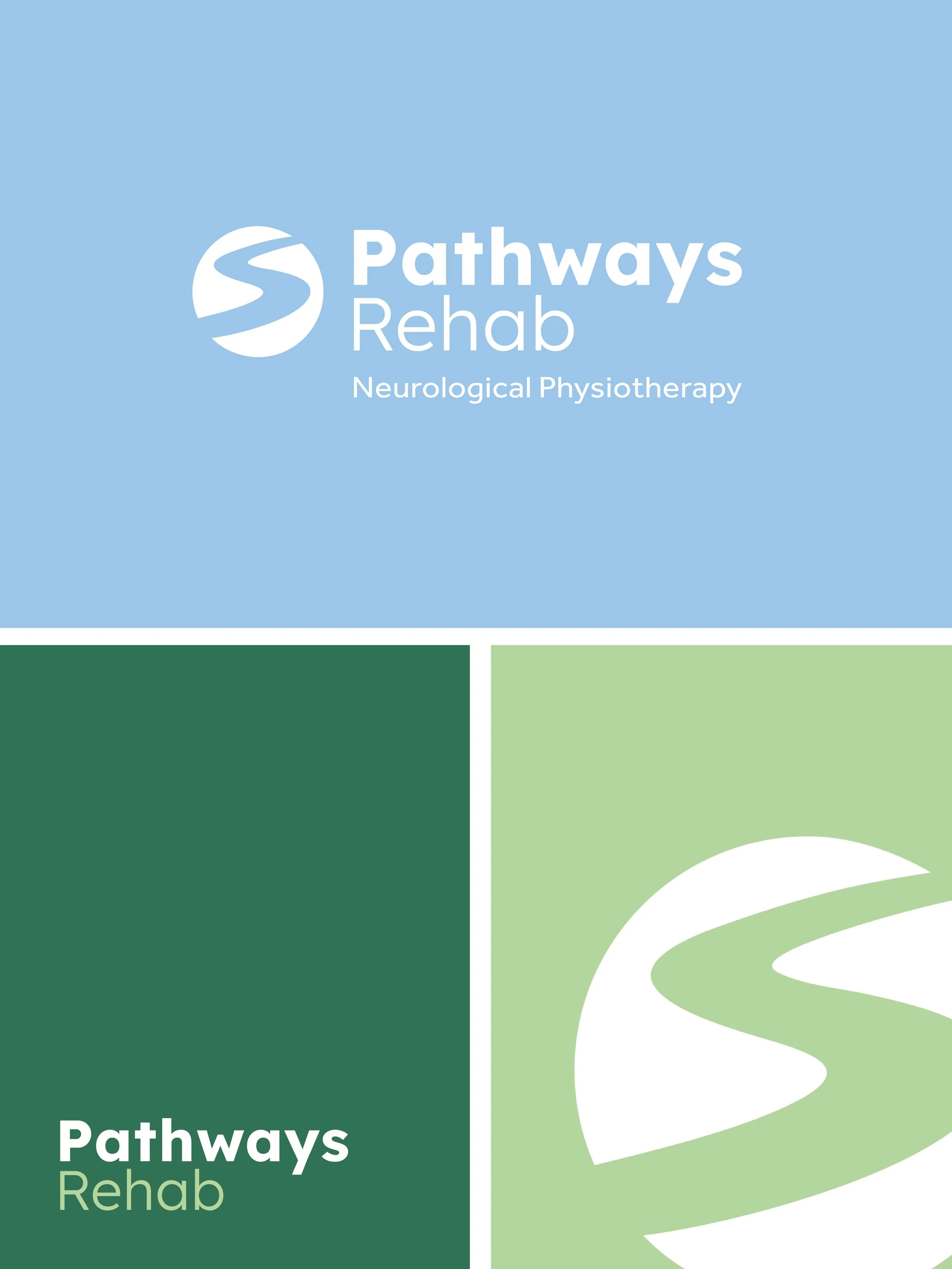
For Pathways Rehab, we built a visual identity that balanced two things - clinical confidence and emotional connection.
The colour palette stepped away from expected healthcare tropes and leaned into vibrant, energising tones that felt hopeful and alive.
The typography was clean and contemporary - confident, but never cold.
The visual language felt premium without feeling corporate.
A modern face in a category that often feels visually outdated.
Approachable, progressive, uplifting and fresh.
Most importantly, it felt like them.
The Problem
One of the biggest mistakes businesses make (especially in clinical industries) is assuming professionalism has to look conservative.
It doesn’t.
A brand can be modern, vibrant and full of personality while still feeling credible. In fact, in industries where every competitor looks interchangeable, being distinctive becomes one of your strongest commercial advantages.
Kate and Rose were clear from day one…
They didn’t want to look like every other care provider in the Illawarra.
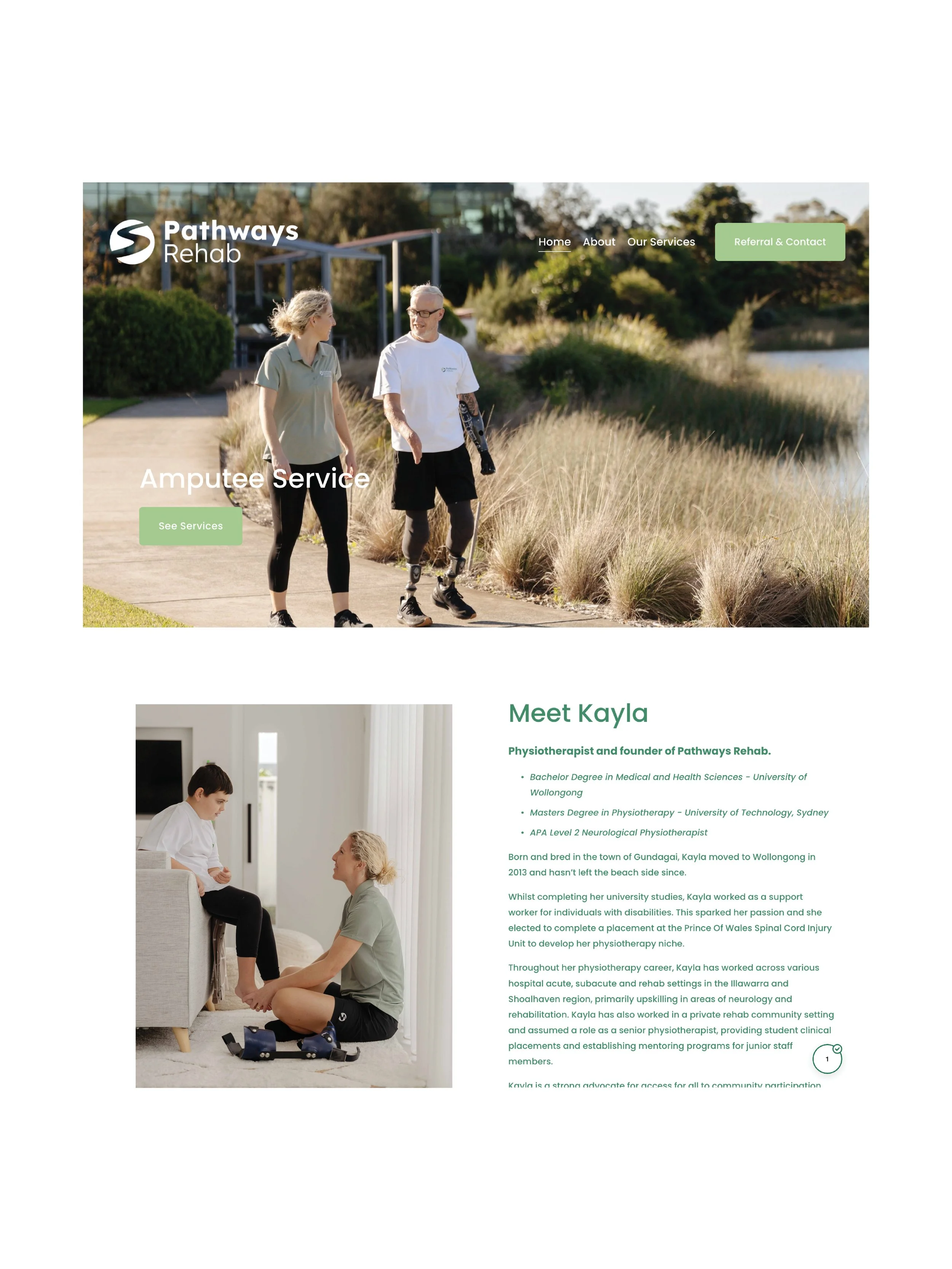
Brand Translated into Premium Web Design
Branding sets the tone. Web design turns it into experience. For Pathways Rehab, the website needed to be capable of more than the minimum.
“It needed to communicate complex services clearly, build trust quickly, and make information accessible for a wide audience.”
That meant designing around:
easy navigation
clear service explanations
strong emotional messaging
mobile-first usability
search discoverability for local healthcare services
a professional digital presence that reflects the quality of care provided
The result? A website that feels calm, polished and intuitive, while still carrying warmth and personality.
Why professional branding matters more than ever
Anyone can choose colours. Anyone can build a Squarespace site.
However, building a brand that feels cohesive, strategic, positioned, clear in messaging, visuals and digital experience - takes expertise.
That’s the difference between:
“we have a logo” and “we have a brand people remember.”
For service businesses in Wollongong and across the Illawarra, especially in healthcare, allied health, wellness and professional services; branding is no longer optional polish.
It’s market positioning.
It’s trust-building.
It’s how people decide whether you feel established, capable and worth contacting.
Looking for a brand designer or web designer in the Illawarra?
At MONOCROW, we build brands and websites for businesses that want more. We create thoughtful, strategic design that helps businesses become memorable in markets crowded by sameness.
Whether you're launching a new venture or repositioning an established business, branding done properly changes how people see you and how they choose you.